Everything You Know About Color is a Lie
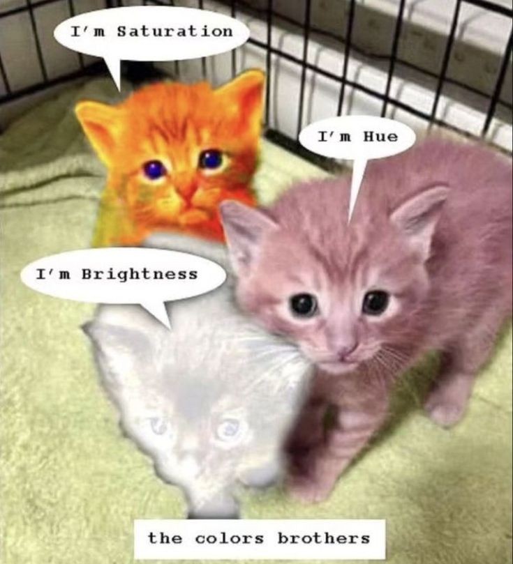
This one will be about hue, but the other two will come in handy at one point as well.
I have unholy amounts of color theory brainrot and nothing to do with it so a while ago I made five twitter polls about that topic. I was supposed to write this post once the last poll ended... and now I'm two weeks late. You're still getting it though cause, despite my chronic procrastination, I aspire to be a man of my word. Which should be easy to achieve, as long as I never set a deadline in stone.
Now, let's cut the shit and get to the first poll.
Poll #1 The chartreuse Mandela effect
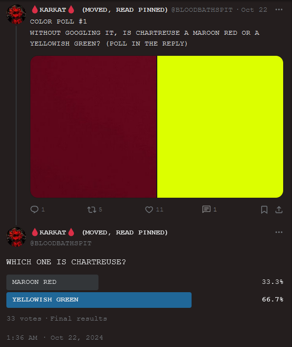
Chartreuse is a yellowish green color, named after a french liqueur available in green and yellow versions. However, some people remember it as some sort of a reddish hue. I assumed it must be cause it's french and makes most people think of wine but that's just my guess.
One third of the people who voted in this poll were wrong. Which seems reasonable enough - chartreuse isn't really taught about in schools.
Poll #2 What is violet exactly?
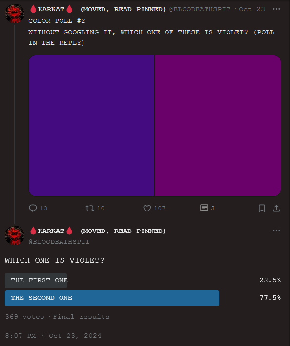
The second poll was a homestuck trap.
If you never read homestuck, all you need to know to understand this one is that there's different blood colors in it. And the author of the comic - Andrew Hussie - got some of them horribly wrong. Most notable example of this, in my opinion, being the way he fucked up purple and violet.
Listen, all "purples" can be called purple on their own. That's not the case with violet though. If you have two purples - the first one having more red and the other one having more blue - what you actually have is a purple and a violet, respectively. You know how "violets are blue"? That's how you can remember which is which easily.
Anyway, the point I'm getting at here is that Hussie got them backwards, either due to stupidity or to fuck with the readers. And most of my followers are homestucks perpetuating this blatant lie, whether they realize it or not.
This poll got 369 votes (that's 11.18181818181818 times more than the first one) because everyone was sharing it around as a "homestuck poll". Well, I hate to break this to you but this was NOT a homestuck poll. This was a color theory poll and majority of you failed. Now sit the fuck down.
Poll #3 What constitutes blue?
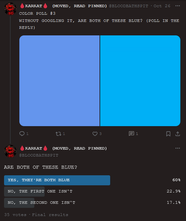
Now some of you will hate me for this one cause you could argue there's no one correct answer. I think otherwise though. Hear me out. The first shade may seem a bit grayish but it is in fact a light cornflower blue. 22.9% of people who said it's not blue were wrong. Now, the problem begins with the second color...
Does it look blue? It probably does to most. What you're looking at is cyan and it's made from a mixture of blue and green. This particular one borders on blue but that's deliberate on my part. I couldn't make the poll too easy, you know. Some will even say it's considered blue in layman's terms and therefore the first answer should be correct too... But to those of you I say: you're wrong.
Calling cyan blue is like calling violet blue. You're kind of right, it's made majorly of blue... but it's also a whole separate thing! You wouldn't call magenta "red" or orange "yellow", now would you? Ok, if you lived hundreds of years ago then maybe you would. But those times are long gone. We have words for all those extra colors now. And I argue that cyan should become one of those colors. It deserves to be one. Why? Because it's one of the three primary colors when mixing ink!

Don't believe me? Go to your printer and check what colors of ink, other than black, it has. Yellow, magenta, and CYAN. That's right, the "primary" colors they taught you at school were a lie and also the reason why you'd always get muddy diarrhea shades. The CMYK palette will give you the biggest range of vibrant as fuck hues. You can replace cyan with sky blue if that's all you can get your hands on but forget about sapphire blue. That one, along with red and green, is a primary color of light. Ever heard of RGB? Useful for screens, photography, and understanding how our eyes process color, but not as much when painting.
Furthermore, I think cyan should be a spectrum encompasing all greenish-blue and bluish-green shades, such as turquoise, teal, and aqua. Green is hogging way too much and blue is hogging even more. They need to be stopped.
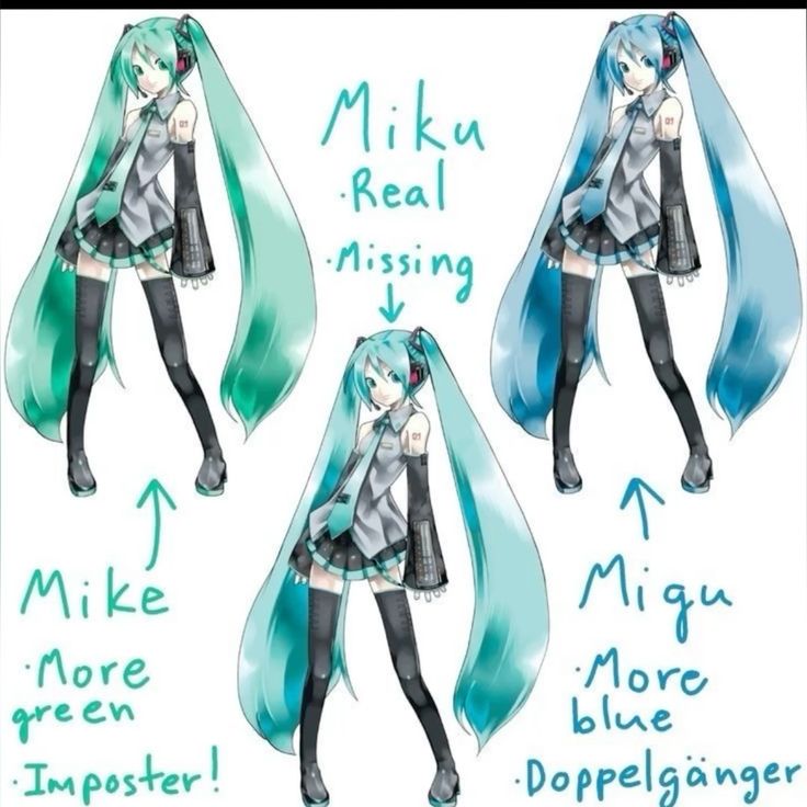
Finally, a solution to the age-old debate. Miku is not green or blue, but cyan.
Poll #4 Brown and what's in a hue?
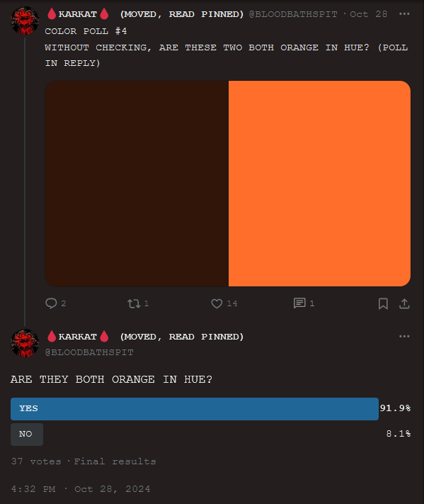
Have you ever seen brown light? Or a neon brown color? No the fuck you didn't. Unless you somehow managed to conjure up one of those impossible colors like green-purple.
Brown is kind of like gray - neither of them are their own separate hues. You get gray from taking saturation away from colors. And if you take away some brightness from few specific colors (most notably orange but in some cases red or yellow), you get brown. The brown shade in this poll is the same exact hue as the orange. They just have different levels of saturation.
This poll was the easiest one out of all of them, as only 8.1% of people who voted got it wrong.
Poll #5 Is magenta real?
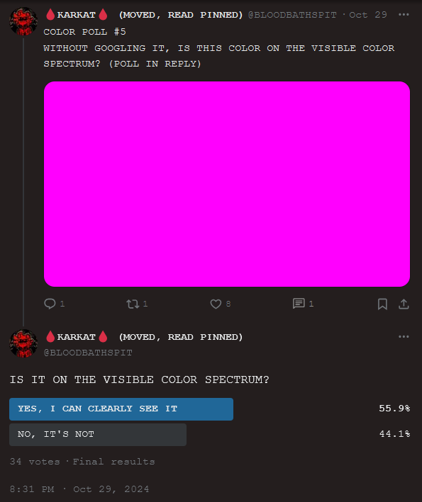
This was another intentionally misleading one. Yes, magenta is real. Yes, you can see it with your eyes. But it's not a spectral color with a wavelength. It's an extra-spectral color.

All spectral colors, courtesy of my good old friend wikipedia. No magenta in sight.
I could go more in-depth about why that's the case but this post is already on the longer side and I doubt more than two people are even gonna get to this part.
Here's a fun fact for you though. Other extra-spectral colors, besides magenta, include: grayscale, desaturated colors, all violet-red colors, impossible colors, and metallic colors!
But hey, what do I know? Apparently everyone sees colors differently, so make sure to explain in excrutiating detail just how wrong I am about all of this in the comments below.
After all, this is just a theory. A color theory.
Posted on 16/11/24 at 02:51
